National Logo
Our official Wild Ones® logo is one of our most visible brand assets. Using it appropriately protects the integrity of our brand and helps people remember who we are.


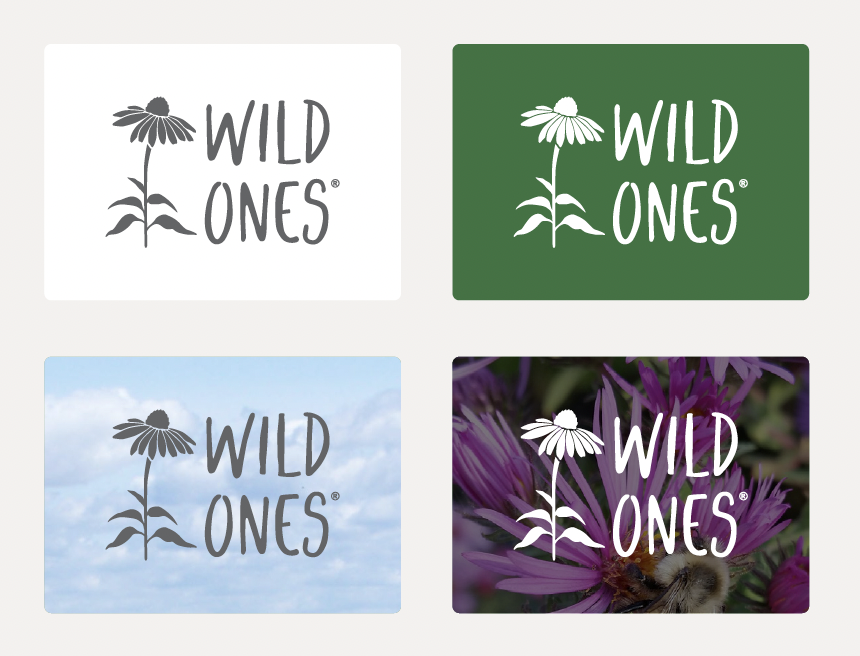
For web and print, use the brand gray or reverse-white logo depending on your background. Gray can be used on lighter backgrounds and reverse-white over darker backgrounds or images.

Chapter Logo
To maximize the impact of our collective work together, chapters represent their brands with shared visual identities, localized for each region.
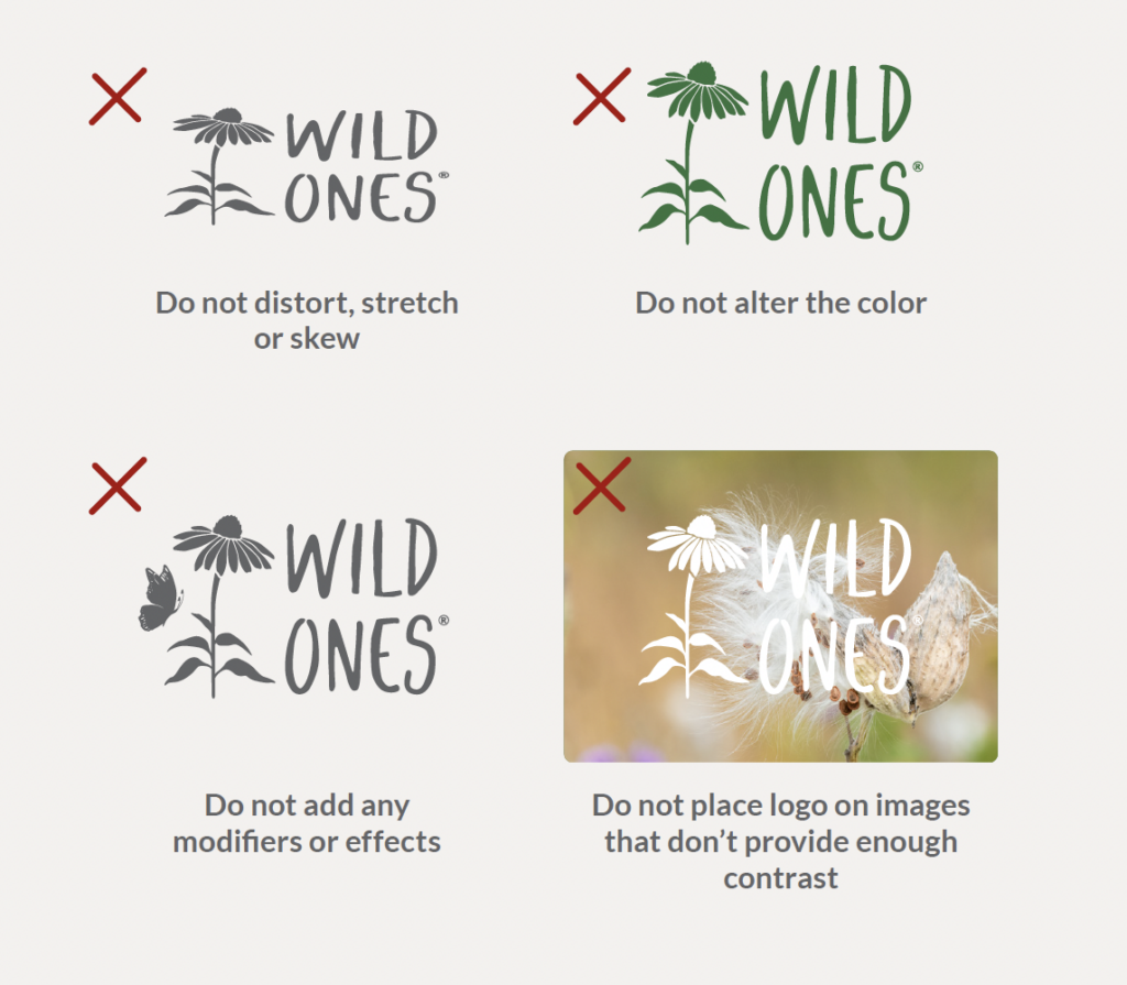
Incorrect Usage
Below are logo use mistakes to avoid, as they don’t meet our guidelines. These rules should be followed for both the national and chapter logos.

Clear Space
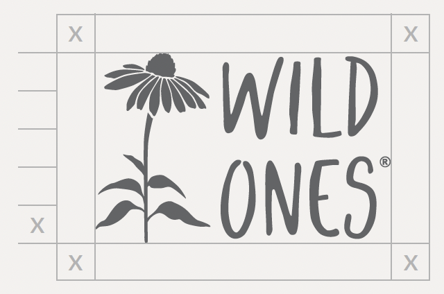
Just like native plants need enough space to thrive, so does our logo. Allow 1/5 of the full height of the logo on all sides to keep other elements from crowding the logo. For example, if the height is 1.25″, the clear space would be .25″.

Minimum Size
The logo should never be smaller than the recommended sizes for print and digital reproduction.

